
After thinking through it, I can see where TinierMe has room for improvement and I can also see that more users and more content will clutter it further so that one day it may be as gaudy and cluttered as Gaia. At this point, it is not really a fair comparison. That being said I have decided to put the rest of the series about Gaia Online versus TinierMe on hold until TinierMe reaches a more stable level.
Tag Archives: GaiaOnline
TinierMe vs. GaiaOnline- Part 2 (updated)
This post is old and outdated and no longer reflects my current views on TinierMe.
However, unlike the previous updated post I still stand by my opinion that TinierMe is overall a prettier site and it’s much easier to make friends there.
(Comments have been disabled as of 07.04.11- feel free to treat this as an archive post)
__
-

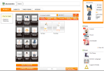
- You can also organize the inventory on a completely separate page.

-

- Click an item in the wardrobe and you get a list of options. Placing items in the recycle bin deletes them and refunds you 5 “chibi coins”

-

- On a separate page the user’s entire inventory is displayed (equip-able and non-equip-able)

-

- Working with your inventory is merely a matter of simple folder organization.

-
- Gaia’s inventory is organized in a secondary tabbed navigation lets you pick equip-able items to put on by category.

-
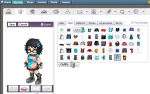
- After clicking “change” in the sidebar nav, you get the wardrobe page, which looks like this.

-
- My current Gaia “avatar” as seen in the permanent header.

-
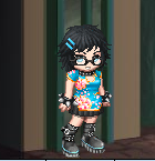
- My current TinierMe “selfy” as seen in the permanent sidebar.

Once again, design and usability-wise TinierMe wins out because of simplicity. While the number of items is still limited and the systems are still being worked on, the organization of the inventory and how easy it is to change your avatar in TinierMe is preferred to the multi-page system on Gaia Online. At least, for me.
Also, on a different note, the style of the avatars in TinierMe is less flashy and much cuter in my opinion. It’s obvious that mostly female users are on TinierMe, compared to what I think is around 40/60 M/F on Gaia. I will have to double-check those stats though, it’s only an estimate. Despite this, most of my new friends on TinierMe are male- and international. I’ve already made friends from Denmark, Finland and various parts of the UK. I love making international friends, it’s so fun and exciting. GaiaOnline is “international”, but was created and is hosted in America while TinierMe is a product of Japan, making it more internationally accessible.
TinierMe vs. GaiaOnline- Part 1 (updated)
Wow, it has been a year and people are apparently STILL referring to this for information. Well, I personally don’t use TM anymore (or Gaia Online for that matter) so I never bothered to update this article reflecting that, but I suppose I should now that it’s my most-commented-upon article.
This post is old and outdated and no longer reflects my current views on TinierMe. I personally think that now they are about equally bad.
___
Part One will focus on the differences in the website design- the first thing I noticed when I went to sign up for TinierMe suggested to me by a friend from highschool that I hang out with on deviantART and GaiaOnline. TinierMe is still in Open Beta and there isn’t much to do yet, but so far so good. It’s cute, fun and I love the interface. Here’s a comparison of the two “main profile” pages that appear for users when logged in and the two main pages that show up when a user reaches the site unregistered or before logged in. They show the best examples of layout.
(click to enlarge)
-

- The GaiaOnline front page as seen by a non-registered user.

-

- The TinierMe front page as seen by a non-registered user.

-

- My own “My Gaia” main page on GaiaOnline.com

-
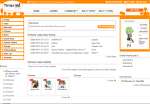
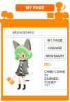
- My own “My Page” main page on TinierMe.com

TinierMe’s site is cleaner and more minimalistic and modern. They picked a orange monochromatic scheme with light accents of green and gradients in greys and whites. It’s all very clean and well organized. My main page here includes a simple 3-column layout with a navigation bar to the far left, a space for links and content in the middle and my own personal panel to the far right. All of the major content sits neatly above the fold and it’s mostly text and small icons so it is not cluttered at all. The navigation panels on the left and right are consistent throughout the whole main portion of the site. It is, overall, a very nice, clean and well presented site that is easily navigated.
GaiaOnline’s site is packed with stuff. This page displays only the “My Gaia” page which shows my avatar, house, car and status on the left, and an RSS-type feed of information about my friends on Gaia, and other activities which I can set specifically to show by changing my Feed settings in the middle. My main navigation and avatar are located in the header at the top of every page. There are easily five or six different forms of navigation to be found, from drop-downs to links and tabs. Gaia Online recently updated the look of it’s user interface again to make it more, what I consider, Web 2.0-y. Things are rounded and shiny, but not at all what I would call clean and neat. There seems to be stuff everywhere and to a complete newbie this page alone would be a nightmare to navigate. Plus, GaiaOnline doesn’t seem to understand that all the best and most-used sites are going for the jell-o layout; none of that left-aligned crap that leaves 500 pixels of background pattern for me to stare at on the right.
TinierMe is still new and there aren’t any advertisements or promotions yet, so it’s bound to get more cluttered, but for now it’s very nice and impressive design-wise. Much more-so in my opinion than GaiaOnline, which is understandibly much larger and therefore more cluttered, but still, I would sacrifice a little content to regain simplicity, especially in the menus and navigation. Not to mention, Gaia doesn’t seem to have a color scheme anymore. I don’t know what happened, but for now I much prefer TinierMe to GaiaOnline. Opinions may change as the site evolves, we’ll see.
